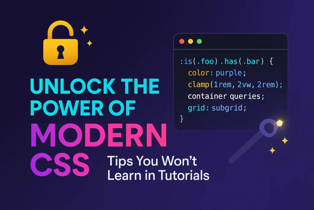
Unlock the Power of Modern CSS: Tips You Won’t Learn in Tutorials
🚀 Tired of basic CSS tips? It’s time to unlock the secrets pros use every day.
🎯 Discover modern CSS tricks you won’t find in beginner tutorials.
💡 From container queries to cascade layers—level up your CSS game now.
⚡ Build faster, smarter, and more responsive designs with advanced CSS hacks.
Modern CSS is no longer just a tool to make websites look pretty—it’s a dynamic, evolving language that plays a crucial role in performance, responsiveness, accessibility, and interactivity. While many tutorials skim the surface, the real power of CSS lies in advanced techniques, lesser-known properties, and new features that can radically transform your workflow and output. Below, we explore modern CSS techniques that will give your web projects a sharp edge over the competition.
🔧 Embrace CSS Custom Properties (Variables) Like a Pro
CSS variables, also known as custom properties, are a game-changer for scalable, maintainable design systems.
:root {

--primary-color: #2c3e50;

--accent-color: #e74c3c;

--font-stack: 'Segoe UI', Tahoma, Geneva, Verdana, sans-serif;

}
These variables can be reused across components, themes, and media queries. What’s often overlooked is their runtime flexibility. Variables can be manipulated via JavaScript, offering real-time theming and UI responsiveness.
document.documentElement.style.setProperty('--primary-color', '#3498db');📐 Use Logical Properties for Global Responsiveness
Forget margin-left and padding-right. Logical properties like margin-inline-start or padding-block-end provide more flexibility across writing modes, especially for internationalized websites.
.card {

padding-inline: 1rem;

margin-block: 2rem;

}
Logical properties adapt better to languages that read right-to-left (RTL) or vertically (like Japanese), allowing for truly global-friendly layouts.
🎯 Target Elements With :has() – The Parent Selector We’ve Been Waiting For
One of the most anticipated features in CSS is the :has() pseudo-class. It acts like a parent selector, which was previously impossible in pure CSS.
.card:has(img) {

border: 2px solid var(--accent-color);

}
This opens the door to context-aware styling where elements adjust based on their children’s presence—perfect for dynamic UI components, conditional displays, and more.
⚙️ Advanced Grid Techniques with subgrid
The subgrid property, supported in Firefox and gradually rolling out elsewhere, allows nested elements to align perfectly with their parent grid layout.
.parent {

display: grid;

grid-template-columns: 1fr 2fr;

}
.child {
display: subgrid;
grid-column: span 2;
}
This feature makes it far easier to maintain consistent layouts across nested components without duplicating grid definitions.
🎨 Container Queries – Media Queries Evolved
Stop relying solely on viewport-based media queries. With container queries, components become truly responsive to their containers.
@container (min-width: 600px) {

.card {

flex-direction: row;

}

}
Wrap your components in a container and define styles that respond to its width or height. This leads to modular, reusable, and predictable design patterns.
🔥 Clamp() for Perfectly Fluid Typography and Spacing
Fluid design has never been easier than with clamp(), which allows you to set dynamic values with upper and lower bounds.
h1 {

font-size: clamp(1.5rem, 2vw + 1rem, 3rem);

}
This ensures optimal readability across screen sizes without breakpoints or media queries. Use clamp() for spacing, margins, and padding for fully responsive design.
🧠 Responsive Units: Embrace svh, lvh, and dvh
Standard vh units can misbehave on mobile browsers with dynamic toolbars. Enter the new viewport units:
svh: small viewport heightlvh: large viewport heightdvh: dynamic viewport height
These provide accurate layout control across devices, eliminating the infamous mobile jumpiness.
.fullscreen {

height: 100dvh;

}
📏 Use Aspect-Ratio for Media and Layout Stability
The aspect-ratio property removes the need for padding-hack tricks for image or video containers.
.video-wrapper {

aspect-ratio: 16 / 9;

}
This simplifies media display, maintains layout integrity, and reduces unexpected shifts—ideal for Core Web Vitals.
🪞 Apply accent-color for Native Form Control Styling
Forget full-on form redesigns. With the accent-color property, you can style native controls like checkboxes and radio buttons consistently with your brand.
input[type="checkbox"] {

accent-color: var(--primary-color);

}
Lightweight, accessible, and cross-browser—no more CSS gymnastics needed.
📦 Layered Positioning with @layer and Cascade Layers
Control CSS specificity like never before using @layer.
@layer base, components, utilities;
@layer base {
h1 { font-size: 2rem; }
}
@layer components {
.button { color: var(–primary-color); }
}
Cascade layers help avoid specificity wars and keep CSS modular, predictable, and maintainable.
🧩 Utility-First CSS with Custom Property Combinations
Custom properties allow for creating mini utility frameworks within vanilla CSS.
:root {

--u-padding: padding: 1rem;

--u-margin: margin: 1rem;

}
.card {
var(–u-padding);
var(–u-margin);
}
This technique promotes DRY (Don’t Repeat Yourself) principles and leads to cleaner CSS architecture.
🌈 Advanced Visual Effects with backdrop-filter and filter
Create modern UI effects like glassmorphism using native CSS filters.
.glass {

backdrop-filter: blur(10px);

background-color: rgba(255, 255, 255, 0.1);

}
Pair with filter, mix-blend-mode, and mask-image for sophisticated, lightweight visual experiences without relying on JavaScript or images.
⚡ Performance Tips: Reduce Repaints and Use Will-Change
Modern CSS isn’t just about appearance—it’s about performance.
Avoid animations on properties like
top,left,height, andwidth.Prefer
transformandopacityinstead.Use
will-changeto notify the browser ahead of time.
.card {

will-change: transform;

}
This minimizes repaints and maximizes smoothness.
💼 Final Thoughts: Embrace the Future of CSS
Modern CSS is not about knowing every property—it’s about thinking in systems, embracing new standards, and building designs that scale with grace. Whether you’re working on a startup’s landing page or a high-traffic platform, mastering these advanced CSS techniques will put you ahead of the curve.
Take these techniques, experiment, combine them, and build experiences that are not only beautiful but blazing fast, scalable, and future-proof.